IT'S ALL ABOUT THE TONE
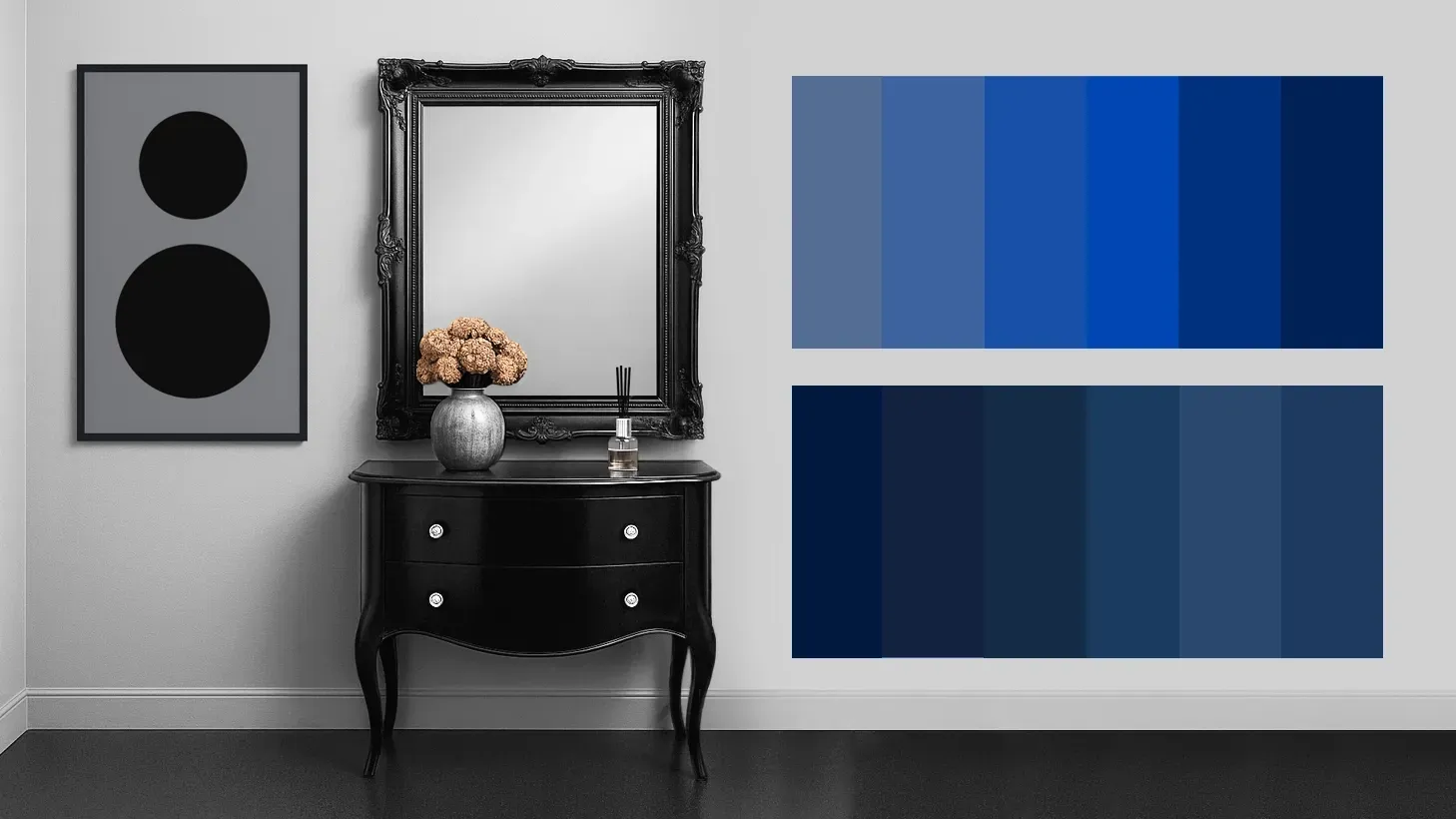

Die bildliche Darstellung von 12 Farbnuancen aus Blau:
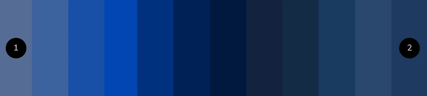
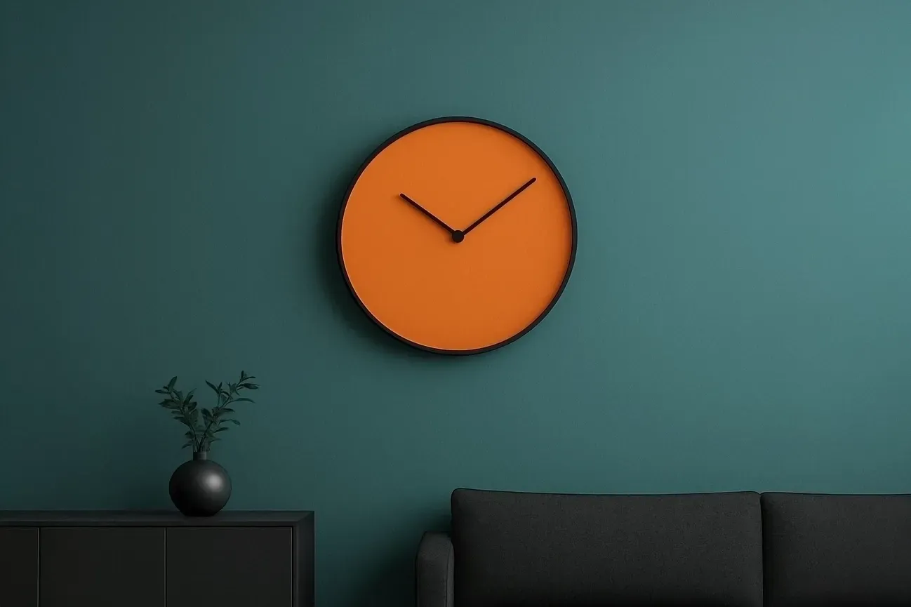
Die Farbe (Nr. 1) #556d94 enthält hauptsächlich entsättigtes Dunkelblau, im vergleich die Farbe (Nr.2) #1f3960 größtenteils Blau.
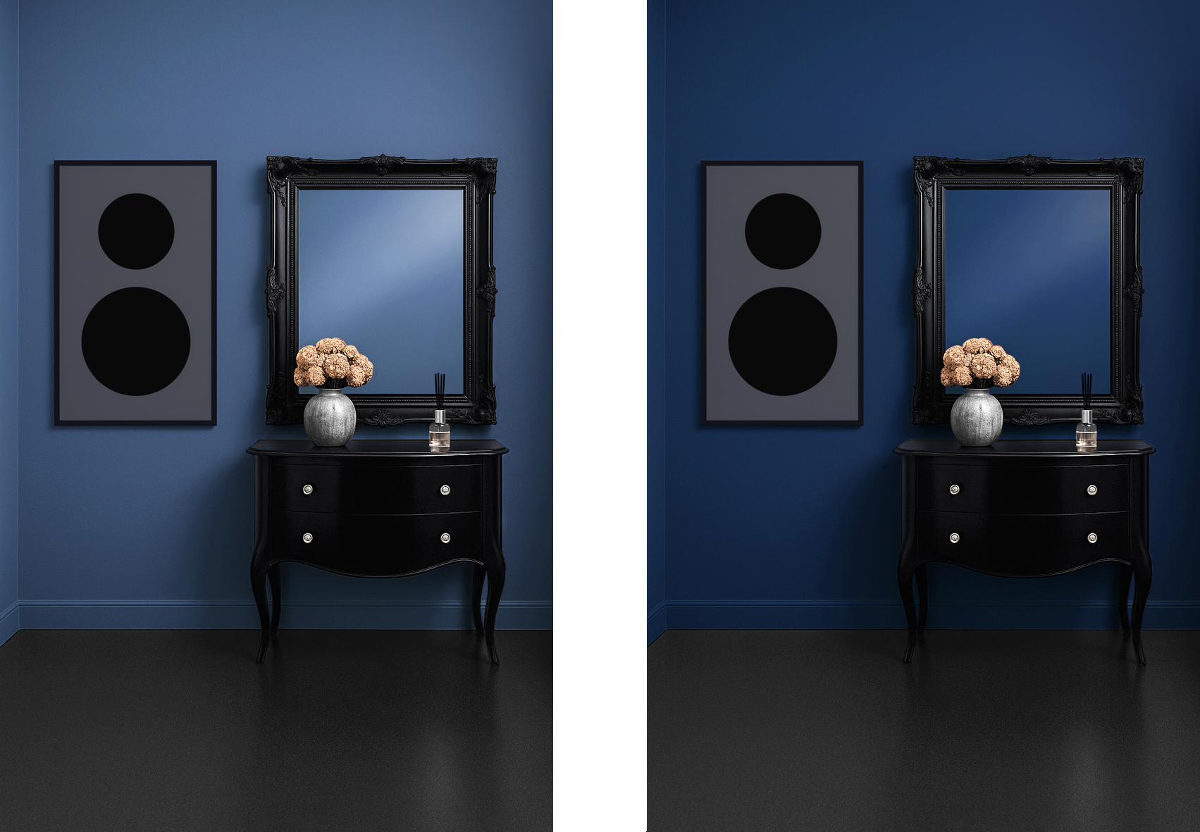
Blau hat in der Raumgestaltung eine besondere Wirkung, sowohl psychologisch als auch atmosphärisch. Diese Farbe gilt als beruhigend und entspannend, da es oft
mit Ruhe, Klarheit und Gelassenheit verbunden wird. Helle Blau Nuancen wirken zum Beispiel frisch, freundlich und luftig, dunklere Blautöne vermitteln Tiefe, Seriösität und eventuell Eleganz. Blau zählt zu den kühlenden, zurückweichenden Farben und lässt oft Räumlichkeiten größer erscheinen, da es optisch in den Hintergrund tritt. Besonders in kleinen oder niedrig wirkenden Räumen kann diese Farbe für mehr Weite sorgen. Durch den kühlen Auftritt, kann es in besonders warmen, bzw. sonnigen Räumen für eine ausgleichende Atmosphäre sorgen, in ohnehin kühlen Räumen kann Blau hingegen schnell zu kühl oder distanziert wirken, wenn es nicht mit wärmeren Akzenten kombiniert wird.
The color (No. 1) #556d94 consists primarily of desaturated dark blue, while in comparison, color (No. 2) #1f3960 is mostly blue.
Whether in the real, musical, or creative world, 'it’s all about the tone'. This proverb highlights an important connection, meaning that it is not only what is said that matters, but also how it is expressed, emphasized, or implemented creatively e.g. a sentence can sound friendly, aggressive or neutral, even if the words are identical. A 'wrong tone' can cause stress and disharmony, while a benevolent tone promotes relaxation and harmony. The same applies to the choice of colors in interior design. In the creative world, there are no limits, right and wrong lose their meaning. What counts is the own taste and what mood it evokes. Do you have a favorite color, and how did you decide on that particular color? Was nature the main source of inspiration? Nature has a wide variety of colors, infinite number of color nuances, only a few million are visible to the human eye. In the digital world, depending on the technology, this ranges from 1 billion to (over) 68 billion color gradations.
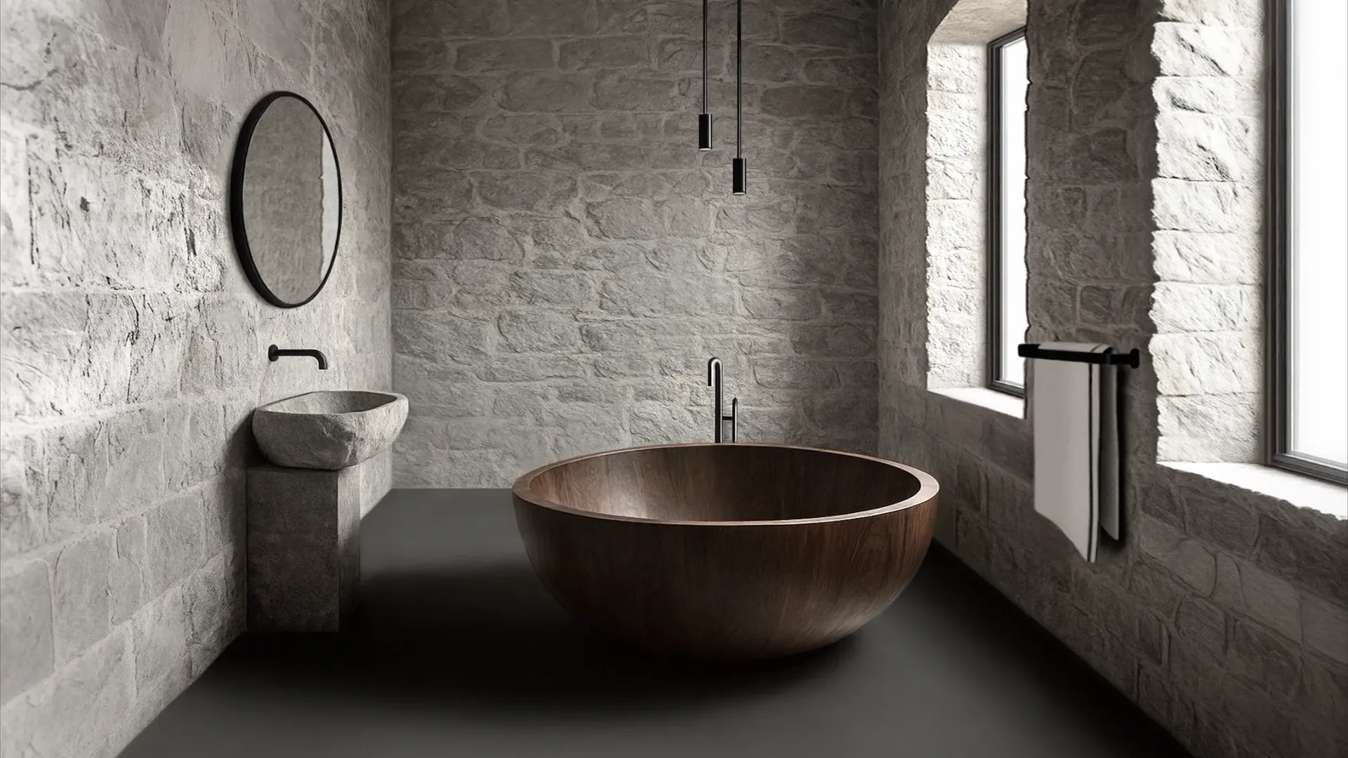
- Blue has a special effect in interior design, both psychologically and atmospherically. This color is considered calming and relaxing, as it is often associated with peace, clarity, and serenity. Light shades of blue, e.g. appear fresh, friendly, and airy, while darker blues convey depth, seriousness, and sometimes elegance. Blue belongs to the group of cool, receding colors and often makes rooms appear larger, as it optically moves into the background. This color can create a sense of space, especially in small or low-ceilinged rooms. Due to its cool character, it can provide a balancing atmosphere in especially warm or sunny rooms, in already cool spaces, blue can quickly feel too cold or distant if not combined with warmer accents.
Conclusion: Technology today can display far more color gradations than the (average) human eye can actually distinguish. One could argue that technology is ahead of humans, or recognize that technology was first created by humans.